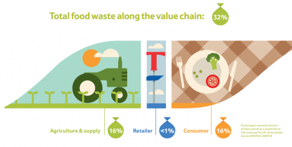
An infographic is a simple and exciting way of transferring complex messages about your Sustainability efforts. Which companies use infographics, and which principles apply to the creation of an effective one?
Infographic (information+graphics) is the representation of information through data visualization. While we’re not talking about a new invention, infographics have in recent years become more widespread along with the increase in the amount of information readily available online.
As people are inundated with more and more information, they seek simpler ways to pick up on the data that is important to them. The preferred and most common way for consuming content is visual: videos, illustrations and photos.
Perfect Match for Sustainability
The content world of sustainability and corporate responsibility is data-intensive and complex to explain and… let’s face it – may sometimes seem a little dry and tedious to people who aren’t directly involved in it (in other words, most of a company’s stakeholders). An infographic can help by simplifying information for the viewer, and even turn it into something attractive.
Companies can use an infographic to highlight data from their sustainability report, drawing on all the topics in the report:


Companies can also use an infographic to illustrate activities and impact in a particular area.
Look at these examples of P&G illustrating the status of women in the company’s leadership, The Co-operative Bank in the UK illustrating the activity that turns it into a responsible bank, Johnson & Johnson illustrating how vaccines are bringing closer to zero the number of HIV-carrying babies born, and Nestlé illustrating Kit Kat's commitment Fairtrade:


You can find many more examples on my Pinterest board by clicking here.
How to Create an effective infographic
A good infographic should tell an entire story in a single moment. It must convey a clear message within 5 seconds of the first observation, and give interesting information to anyone who reads on for a minute. To do this:
- The design concept should match the content world of the data.
- The design should “pack” the totality of the data in a way that will create a clear link between them – in a way that will tell the desired story in the right context.
- The graphics should create a unique and appealing visual experience, and be linked to the brand's marketing communications as a whole.
- The data should be interesting and not trivial; it must be reliable and accurate.
- The text (copywriting) should be written to make for a clear and inviting read.
Plan Before Designing
Before you approach the design phase, define the infographic’s primary target audience. Find out which content world is relevant to them, what they already know about your company, and which new data might interest them.
Also, find out where they're likely to look at the infographic: In a printed report? On your website? On Facebook? On a PC or smartphone screen? The answers to these questions will help you wisely choose the content world, the data and its range, the graphic language and the form of presentation.
Plan in advance where and how to disseminate the infographic: A newsletter to your distribution list? On your Facebook page? A press release? An infographic can also be presented in a video, as in the example of the UK's Co-op Bank.
Avoid creating banal infographics, overloaded with information, or collections of non-related anecdotes. Do good preparation and invest resources (in other words, work with a design person who specializes in infographics) to create a quality product that will successfully tell your story to as many people as possible from your target audience.
If you know of successful infographics in the field of sustainability and corporate responsibility, you’re invited to share the links here in the replies to this post, and I’ll pin them on my infographics board on Pinterest.

